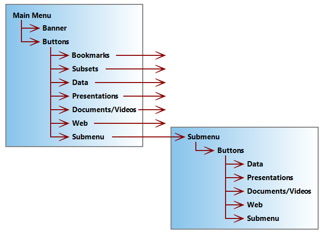
Menu areas in a DiveTab application organize content for DiveTab users. The top level menu typically includes a banner to visually identify the application. Each defined area has a corresponding icon or graphic file, with optional text, that displays as a button. The grid of buttons can extend across multiple screens if more buttons are defined than what fits on a page. The menu orientation adjusts horizontally and vertically as needed.
Here is an example of a typical menu area in DiveTab.

A typical main menu, which is the DiveTab application landing page, can include buttons for accessing data (local and connected) and multimedia content, such as repositories, presentations with bookmarks, documents, and links to DivePort and websites. The DiveTab user selects the button to access the next area, which can lead to additional menu pages or other types of content. Each button corresponds to an area within the main DiveTab script or related scripts. These DiveTab script areas appear as code blocks within the script, such as menu-area and data-area.
Use this ![]() diagram to plan the hierarchy of your DiveTab application.
diagram to plan the hierarchy of your DiveTab application.
See also: DiveTab Areas Overview
